
By Harry Marks
Computers, texting, IM, Twitter, Facebook—all great technologies that have all but made the concept of “by hand” obsolete. Why write a letter when you can shoot off an email? Why pass notes in class when you can text them (showing my age, I know)? As a result of our migration away from writing by hand, it feels as though we’ve lost sight of an art form. Efficiency has usurped legibility.
In no way is this a missive against computing or using computers to complete tasks once done exclusively on paper. Neil Gaiman may write first drafts of his novels with a pen, but many writers just want the words out of their heads and on the page as fast as possible and for that, one cannot beat a full laptop battery and a blank screen in Scrivener. Instead, this is an acknowledgement of a deficiency I realized later in life regarding a, for lack of a better pun, signature part of my identity—my penmanship.
My handwriting has never been horrible, but I’ve never been happy with it. I’m not giving any doctors a run for their money. However, I’ve always envied those who could jot on a Post-It with the caligraphic elegance of someone writing out table numbers on wedding placecards.
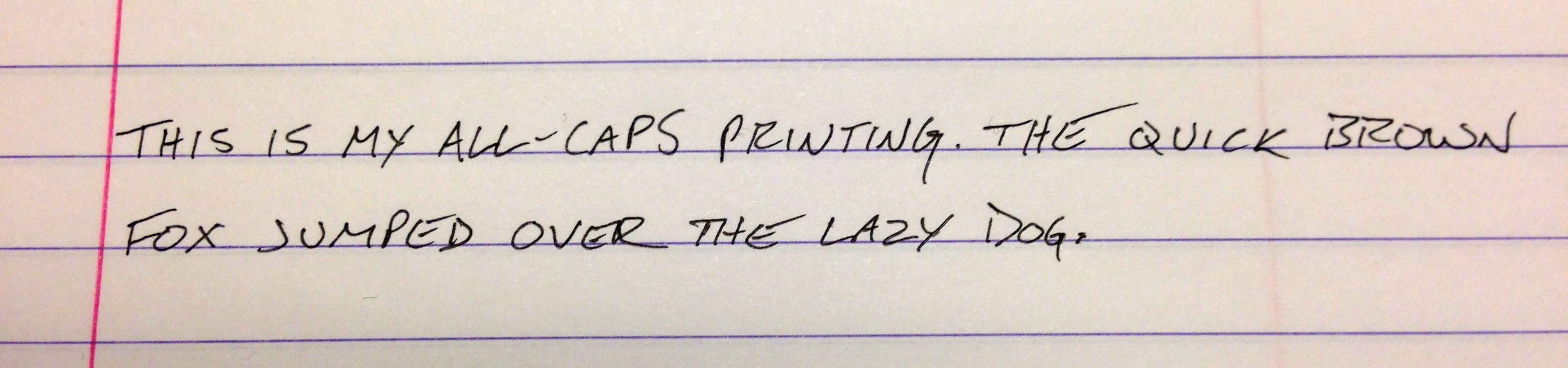
My father’s all-caps penmanship was the first I studied, with its clean, sharp angles and deliberate strokes, like Rockefeller Center in words. I wrote my name, I transcribed passages from books, and took notes all in capital letters in an effort to mimic my father’s style. As a result, I developed a slower, but much clearer way of writing.
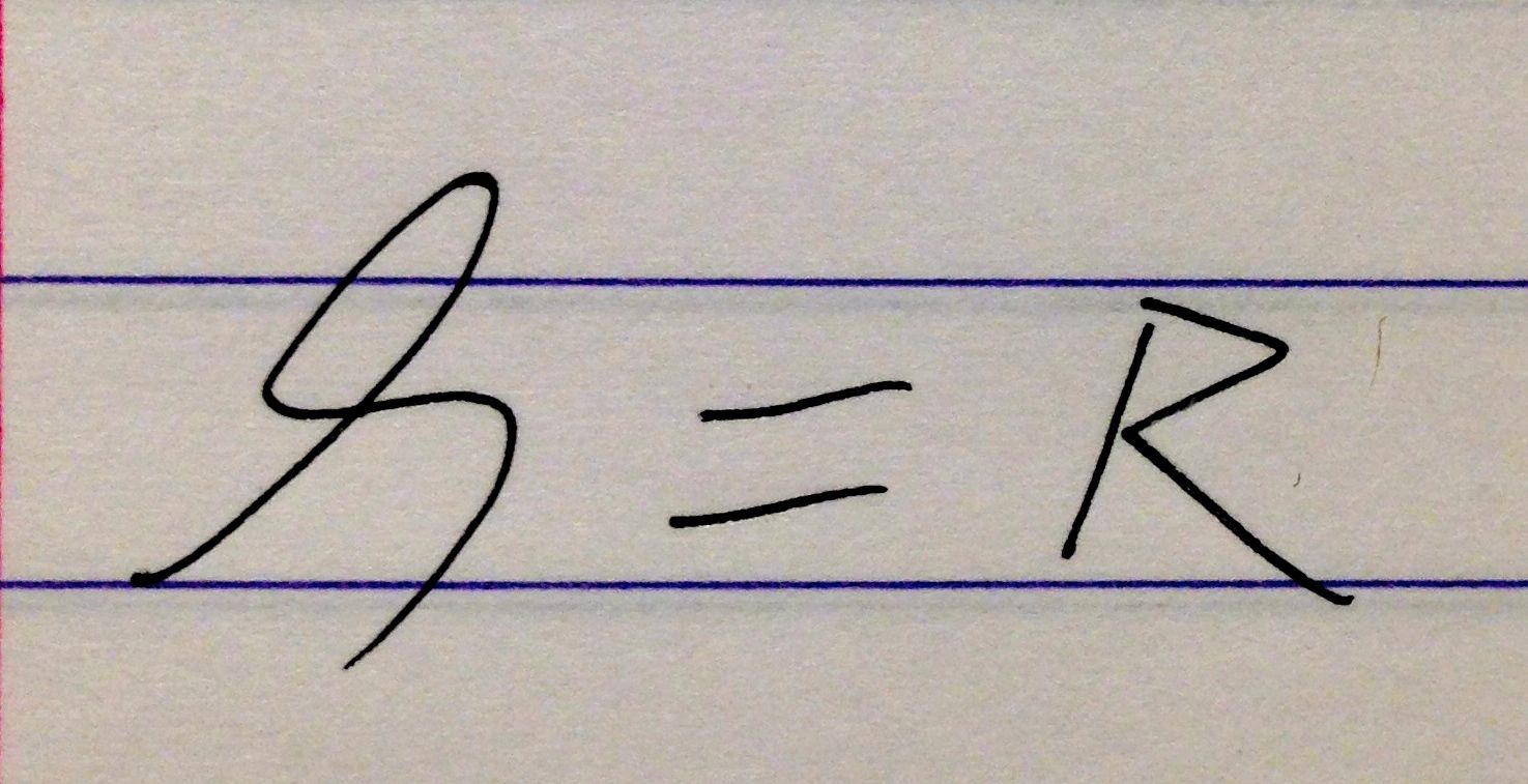
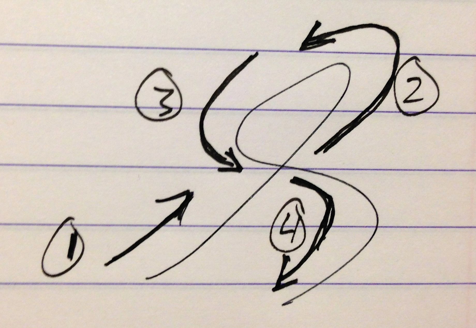
After that, I took special note of the way he wrote the letter “R”, which is perhaps the only “flowing” letter in his alphabet. One stroke. He doesn’t go down and double back up the stem, then complete the large horseshoe and kickstand like a normal R. He goes up, swings left with what looks like a backwards “P”, then crosses over the stem and travels down.
I watched him form that letter over and over again, which was easy since it’s the first letter of his first name, and practiced it myself any time something I wrote called for a capital R. It wasn’t enough for me to draw the letter by itself repeatedly on a page. I needed to work it under my fingers, to become familiar with the shape and comfortable enough to compose it along with the letters that preceded and followed it in a school handout or essay.
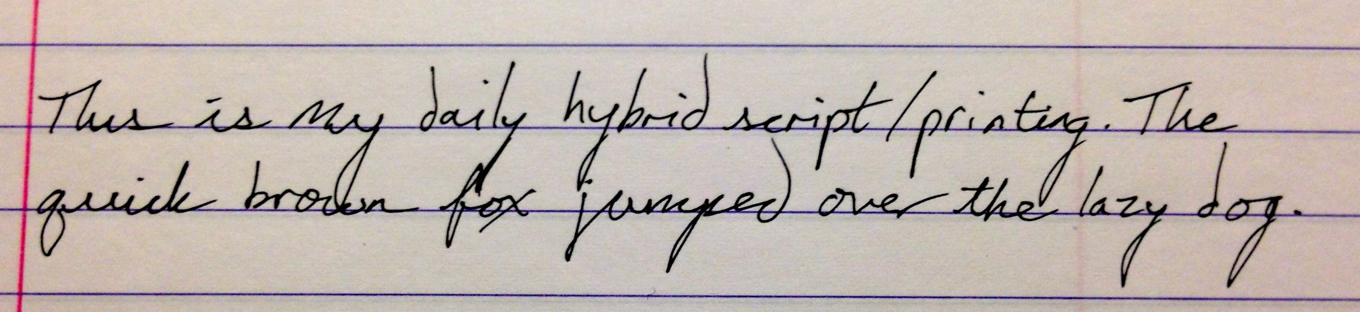
Once I’d mastered it, I did the same with the cursive lower-case S he weaves into the hybrid print/script style he uses when writing quickly.
And that’s the best piece of advice I can give to anyone looking to improve his or her handwriting. It’s what any music teacher or coach will tell a student who wants to hone a skill: study the greats. J.R.R. Tolkien, John Adams, and Thomas Jefferson all had incredible handwriting, most likely due to an early educational focus on legibility and years of refining their styles. In addition, they no doubt utilized tools and techniques to keep their hands and wrists in check.
In the 1800s, Platt Rogers Spencer developed an approach called “Spencerian script” that grew out of his love of nature. According to Script & Scribble: The Rise and Fall of Handwriting by Kitty Burns Florey:
Remembering the joys of nature—the wild flowers, the smooth pebbles, the beams of sunlight, the flight of birds across a sky traced with wispyclouds—he mingled round and angular, light and dark, trailing vines and curling stems, slender upstrokes and shaded downstrokes, swooping capitals and judicious flourishes.
An example of Spencerian script can be seen here. [1]
Spencerian script also incorporated the “whole-arm technique,” which relied on the writer’s entire arm to create each letter, as opposed to utilizing mainly (or only) the wrist. These days we let our wrists do the writing, which can result in choppy “chicken scratch” when rushed.
For those interested in trying their hands (another pun!) at the whole-arm method, the easiest way to start is with a chalkboard. With chalk in hand, compose each letter of the alphabet using the shoulder to do the heavy lifting—not the wrist. Go slowly and make broad strokes. As this gets more comfortable and you’re able to increase speed without a loss in quality, make the letters slightly smaller. Only when the letters are small enough is it time to move to pen and paper. This is not an easy thing to master, but the results are a prettier, more fluid script.
Of course, not everyone in the 1800s had the time to devote to the flourishes and swoops of standard Spencerian. As a result, variations on the script were developed, including a “business” Spencerian that “could be markedly faster and less ornate than the script one might use to copy out a poem or write a love letter.” This came about after individuals such as Charles N. Hall worked to improve their penmanship using the original Spencerian techniques.
Put another way, by studying the handwriting of others, one person was able to develop a style uniquely his own. This has been my goal for roughly 10 years and I like to think I’ve made some progress during that time. I’m always working at it. I’ve been trying my hand at more ornate capital letters and have a particular fondness for John Adams’s capitals, as written in his many letters to his wife, Abigail. They’re fancy without being too ostentatious.
The key to my success thus far has been emulation and constant practice. I start slowly, rendering each new letter one stroke at a time, then build up speed until my S-es and Fs flow effortlessly from my pen. Once they’re under my fingers, my natural style mutates the original letters so they no longer belong to Adams or Jefferson, but to me. That’s my capital M in “Marks.” That’s my R in “Rat.”
The journey from scratch to script can be arduous. You will have plenty of moments where you’ll want to jam your pen into the table and walk away, but to me, the benefits of better penmanship make the frustrations worthwhile. My notes are clearer and more pleasing to read. The first draft of my current novel could be in a museum and I wouldn’t feel ashamed at the handwriting, just the choice of words on the page.
The Cramped is a love letter to the analog. It celebrates the art of doing things the long way and I can’t think of a better way to leave you, dear reader, than with a quote by William Morris that kicks off Script & Scribble and inspires us to appreciate that art:
A true source of human happiness lies in taking a genuine interest in all the details of daily life and elevating them by art.
- If you’d like to learn how to write in this fashion, the website for Spencerian Script and American Cursive Handwriting has a variety of resources available. ?
3 Comments
Comments are closed.